Candlestick Patterns Decoded For Beginners
Candlesticks
Candles may have first been invented in China but Japan made up for it by inventing the candlestick chart! In the 18th century, a wealthy Japanese trader, Munehisa Homma noticed that the market was more influenced by the emotions of the traders than the link between the price and the supply and demand of rice.
While Homma used this tool to analyse the price of rice contracts, it soon became popular, was introduced to the western world and is now a widely used instrument by traders all over.
As we can see in the images below, candlesticks show four price points – open, close, high and low as experienced by the commodity within the time mentioned by the trader. The widest part of the candlestick is called the ‘real body’ and if it is filled or red, it denotes that the open price was higher than the close price and if it is empty or green, it denotes that the close price was higher than the open price. A candle with a filled or red real body is called bearish whereas when the candle has an empty or green body, it is called bullish.
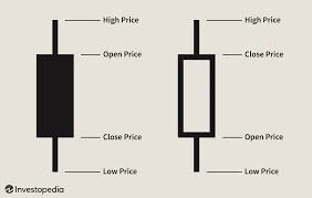
Image source: Investopedia
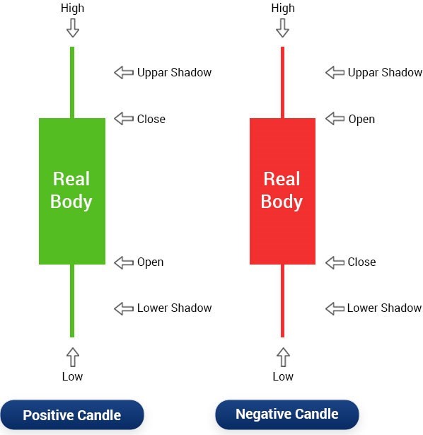
Image source: Edelweiss
Candlesticks are a visual representation of emotions as they showcase the size of price movements in different colors.
Candlestick Charts
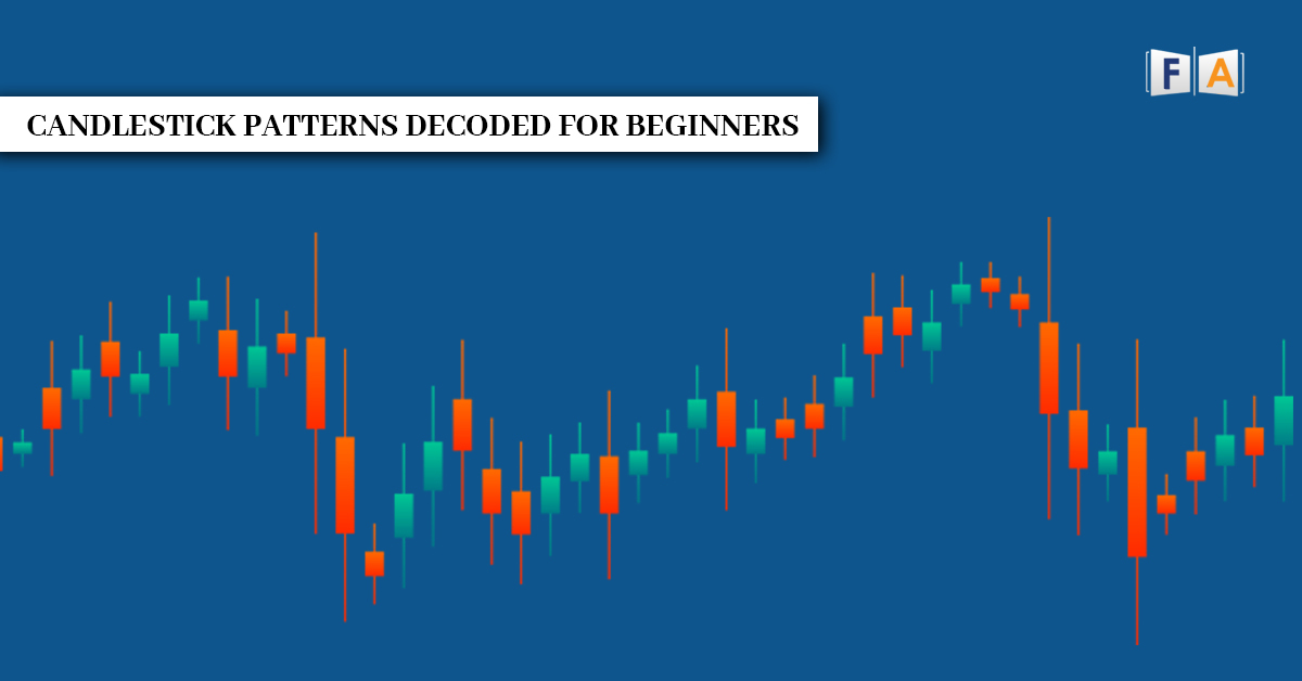
When these candlesticks are mounted on a chart illustrating the movements over a period of time, a candlestick chart is formed. The sequence of the candlesticks on this chart forms various patterns which help traders calculate possible price movements based on past patterns.
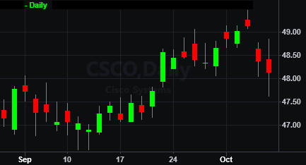
Image source: help.tradestation.com
These patterns can be distinguished between ‘Bearish’ and ‘Bullish’. Bearish patterns suggest that the price is likely to fall and bullish patterns suggest that the price is likely to rise. It is important to note that these patterns point to tentative movements and are not infallible.
Candlesticks Patterns
Now, let’s take a look at some of the common candlestick patterns. These are beginner friendly as they are easy to spot and account for a higher level of accuracy.
1. Doji
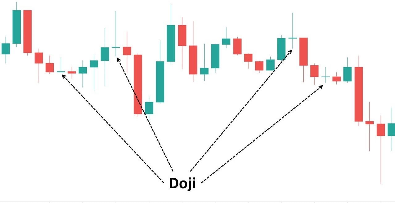
As we can decipher from the image, the Doji candlestick pattern looks like a plus sign. It comes about when the opening and closing prices are very close to each other making a small real body and long wicks. While the plus sign in itself indicates neutrality, its placement in the chart indicates the end of either a steady buying period or a steady selling period. When the Doji appears after a downtrend it signifies the end of a selling period and when it appears after an uptrend, it signifies the end of a buying period.
2. Engulfing pattern
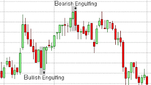
Engulfing patterns consist of two candles and they are visible when the second candle completely overshadows the first candle. It means that either the buyers or sellers are gaining the upper hand depending on whether the bullish or the bearish candle is engulfed.
In a bullish engulfing pattern, the red or filled real body will be engulfed by the green or the empty real body. This indicates that the buyers have taken over from the sellers and that the trend will move upwards.
On the other hand, in a bearish engulfing pattern, the green or empty real body will be engulfed by the red or the filled real body. This indicates that the sellers have taken over from the buyers and that the trend will move downwards.
3. Morning Star
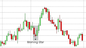
Morning Star is a three candlesticks pattern – a long bearish candle followed by a Doji followed by a long bullish candle. A morning star is formed at the end of a downtrend. The long bearish candle signifies extreme selling, the Doji signifies the end of the selling period and the long bullish candle signifies overtaking by the buyers.
4. Evening Star
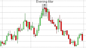
The Evening Star is the exact opposite of the Morning Star. This pattern also includes three candles – the Doji succeeding a bullish candle succeeded by the bearish candle. This pattern appears at the end of an uptrend. The long bullish candle signifies extreme buying, the Doji signifies the end of the buying period and the long bearish candle signifies overtaking by the sellers.
5. Hanging Man
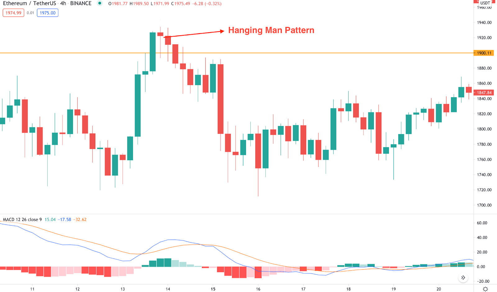
Just like Doji, the Hanging man is a single candle pattern. It occurs at the end of an uptrend. The real body of the candle is small with a lower shadow more than double its size. The upper shadow is small or not present at all. This pattern indicates that the prices opened, the sellers were having their way and lowered the prices, and then the buyers came and tried to salvage the prices but were unsuccessful.
And that’s all for now!
In this blog, we understood what a candlestick chart is and discussed some candlestick patterns for beginners. We also saw how to read these patterns and how these charts can be used for intraday trading. If you want to learn more about candlestick patterns or take up a trading class, check out our website. You’ll find plenty of stock market training courses whether you’re a beginner or not!
Happy learning!


